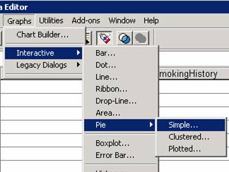
Import Lipid Data.xls (from CS 130 Public) into
Pie Chart
We want to
create a pie chart to show how many people drink some number of cups of coffee
a day.
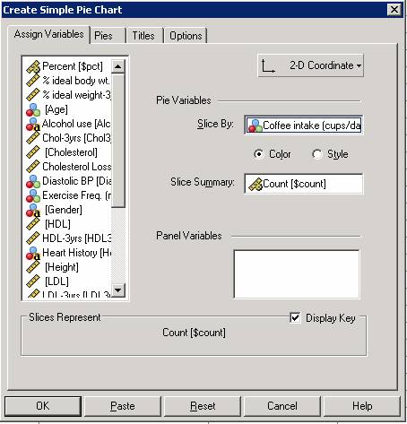 Drag the category variable you want
to chart into the Slice by box. One
slice will be made for each possible category.
Drag the category variable you want
to chart into the Slice by box. One
slice will be made for each possible category.
Slice Summary determines how large to make each slice.
Panel Variables allow you to make one Pie chart for
each category in some other category variable.
Try placing Gender in this box.
The Pies tab allows you to select what to
display on the chart. You can display
the count for each slice, percent, etc.
Save this
Pie chart to a Word document!
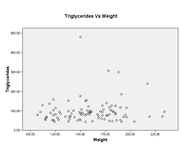
Scatter/Dot chart with Regression
(Trend) Lines!
Build a
Scatter/Dot chart to compare Weight and Triglycerides.
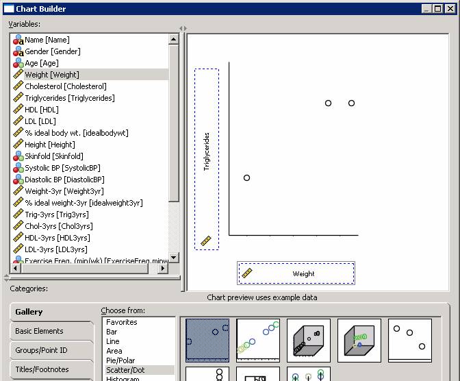
Use the
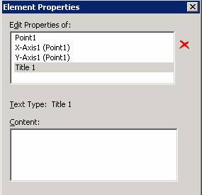
Titles/Footnotes table to add a title.
Select Title 1, write the title in the Content box and press apply.
Press OK and
the chart will appear in your Output Window.
 Double
Click on the Chart to bring up the Chart Editor.
Double
Click on the Chart to bring up the Chart Editor.
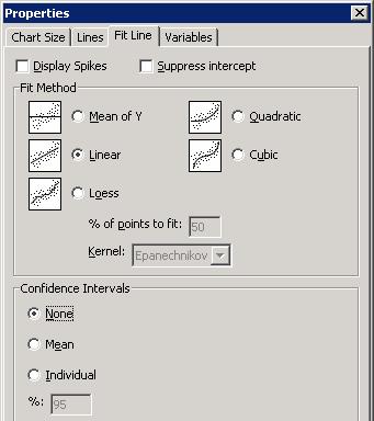
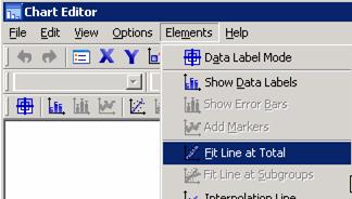
Use the Elements | Fit Line
menu item to add a regression line.
Select the Method. Select an
optional Confidence Interval.
The Lines tab allows you to
change the appearance of the Fit Line.
Add a Linear Fit Line and then add a Cubic Fit Line. Select a Mean Confidence Interval for each.
Press OK, then close the Chart Editor and you will see your Chart
updated in your Output Window.
Copy this chart to the Word document you have open. Answer the following questions in that Word
document.
What does a Mean
confidence interval do?
What does a Individual confidence interval do?
What does Mean of Y mean?
What does Loess mean?
What does Quadratic mean?
What does Cubic mean?
What is the R Squared
Value for each line?
The
Equations
We still need to determine the equations for the above Fit Lines.
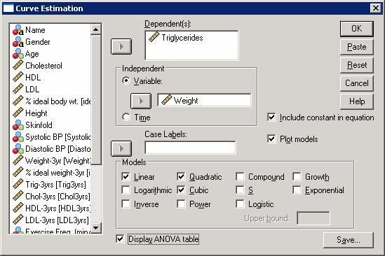
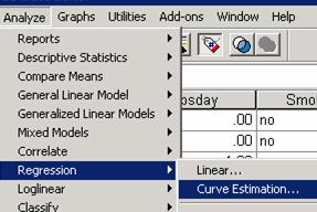
Use the Analyze | Regression |
Curve Estimation menu item to produce various regressions.
Select your Dependent and Independent Variables, and the Regressions
(Models) you want to run.
Make sure you select Display
ANOVA table.
Press OK and data tables will show up in your Output Window along with a
chart with the Fit Lines.
You will get one set of tables per Model.
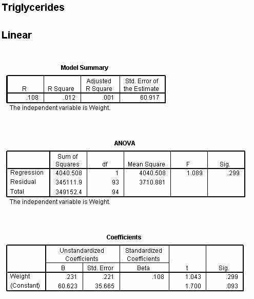
Save the tables and the chart into your Word document.
How do we build a linear equation
off of this? Write the linear equation in your Word document.
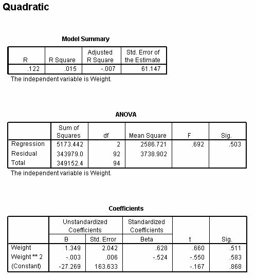
How do we build a quadratic equation from this? Write the quadratic
equation in your Word document.
Answer these questions in your Word document:
What is the Cubic equation?
Which of these three, Linear, Quadratic, or Cubic, is the best fit? How do you know?